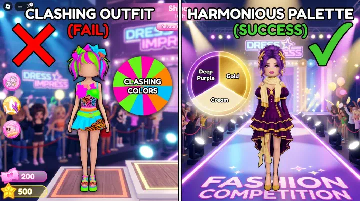
The theme is Gothic Glamour.
You know what to do. Black dress. Dark makeup. Lace gloves. Choker. Veil. Black heels. A tiny dark bag. At the last second, you add dramatic sleeves because the outfit still has room and empty slots feel wrong.
On the runway, you feel safe. Your look is obviously Gothic. Then the votes land.
Two stars.
The winner has fewer pieces than you. Just a deep purple gown, blood-red gloves, black hair, and silver jewelry. Three colors. Clean shape. Easy to read.
That’s the part that feels unfair. You had more Gothic items. They had a better palette.
Dress to Impress doesn’t reward effort the way beginners expect. Voters don’t count accessories. They see the outfit for two seconds and vote based on the strongest signal.
Color is that signal.
If your colors clash, your outfit looks messy even when every item fits. If your palette is clean, simple outfits feel intentional.
Why More Items Don’t Win
The beginner mistake is treating DTI like a checklist.
For Gothic, you add black, lace, gloves, a veil, dark makeup, boots, red eyes, purple eyeshadow, silver jewelry, and maybe one white accessory.
That hurts you for three reasons.
First, voters read color before detail. A clean palette makes the theme obvious before anyone notices lace trim.
Second, too many colors make expensive items look cheap. A VIP dress in four clashing colors looks worse than a free dress in one strong palette.
Third, accessories compete. A red bow, silver necklace, purple gloves, and white stockings all ask for attention. None of them wins.
Good outfits aren’t empty. They’re edited.
A winning outfit has:
- One base color for most of the body
- One support color for theme and depth
- One accent color for the focal point
- Hair and makeup that repeat the same palette
- Accessories that support the outfit instead of starting new color stories
If you already use the DTI Theme Winning Framework, color is the second decision. Category tells the story. Palette tells voters what emotion to feel.
The 3-Color Framework
Pick three color roles, not three random colors.
Base color: the biggest color. Dress, skirt, pants, jacket, or main outfit piece. It should cover about 60-70% of the look.
Support color: the mood color. It appears on gloves, shoes, secondary clothing, hair streaks, or makeup. It should cover about 20-30%.
Accent color: the tiny color that makes the outfit memorable. Jewelry, bag, lips, belt, bow, or one small accessory. It should cover about 5-10%.
For Gothic Glamour:
- Base: black
- Support: deep purple or burgundy
- Accent: silver
For Fairy:
- Base: pale green
- Support: soft pink or lavender
- Accent: gold or white
For Royal:
- Base: navy, emerald, or ivory
- Support: gold
- Accent: ruby, pearl, or silver
Most bad outfits fail because the accent becomes another support color. Red lips are fine. Red lips, gloves, shoes, bag, and hair are not. Now red is fighting the base.
If a color appears in more than three places, it’s probably not an accent.
Color Wheel Rules That Actually Matter
You don’t need an art class. You need four practical rules.
Monochrome wins when the theme is already clear. Use one color family with different shades: black, charcoal, grey; pink, blush, rose. This works for Gothic, Angel, School, Elegant, Baddie, Ice Queen, and Celebrity themes.
Analogous colors feel natural. These are colors near each other: green and blue, pink and purple, orange and yellow. Use them for Fairy, Mermaid, Cottagecore, Spring, and Romantic themes.
Complementary colors need restraint. Red and green. Blue and orange. Purple and yellow. They pop, but they can look like a costume if both are loud. Make one the base and the other a small accent.
Neutrals save risky palettes. Black, white, cream, grey, brown, and denim calm strong colors. Hot pink works better with black or white. Gold looks richer with navy, ivory, emerald, or burgundy.
Theme-to-Palette Mapping
Don’t choose colors from your favorite items. Choose from the theme category.
Dark Themes
Gothic, Horror, Vampire, Villain, Dark Academia, Haunted, Emo, Witch, and Mysterious need low light and controlled drama.
Best palettes:
- Black + burgundy + silver
- Black + deep purple + gunmetal
- Charcoal + blood red + black
Avoid bright white as a large base unless you’re doing ghost, doll, or vampire aristocrat. For item and silhouette ideas, use the Gothic, Dark & Horror Theme Guide. The color lesson is simple: black alone can look flat. Black plus one dark support color looks styled.
Nature and Outdoor Themes
Forest, Jungle, Safari, Beach, Winter, Spring, Cottagecore, Camping, Farm, and Garden need colors that feel like the setting.
Best palettes:
- Sage green + cream + brown
- Olive + tan + gold
- Sky blue + white + sand
- Ice blue + white + silver
Nature themes punish artificial colors. Neon green doesn’t read as forest. It reads as slime. Ask: would this color exist in the environment? If not, make it a tiny accent or drop it.
Royal and Luxury Themes
Princess, Queen, Royal Ball, Gala, Red Carpet, Rich, Celebrity, Elegant, and Masquerade need contrast, shine, and polish.
Best palettes:
- Navy + gold + white
- Emerald + gold + cream
- Burgundy + black + gold
- Ivory + pearl + champagne
Gold signals wealth fast, but full gold often just looks yellow. Use it on trim, jewelry, crown, belt, or shoes. Let navy, emerald, burgundy, black, or ivory carry the body.
Counter-intuitive tip: a princess outfit doesn’t need to be pink. Navy with gold often looks more royal than a pink dress with every sparkly accessory attached.
Cute, Soft, and Romantic Themes
Kawaii, Romantic, Valentine’s, Coquette, Soft Girl, Doll, Fairy, and Pastel need low contrast.
Best palettes:
- Blush pink + cream + pearl
- Lavender + white + silver
- Baby blue + white + pale yellow
- Mint + pink + gold
The mistake is using every pastel at once. Pink, blue, lavender, mint, yellow, and white can look like spilled candy. Pick one pastel as the base, one nearby pastel as support, and one light neutral.
Hair and makeup matter here. A soft pink outfit with black lipstick feels disconnected. Use the DTI Hair Combos & Makeup Pairings guide when the clothes work but the face feels wrong.
Streetwear, Y2K, and Modern Themes
Streetwear, Y2K, Baddie, Trendy, Pop Star, Influencer, Sporty, and Model can handle brighter color.
Best palettes:
- Black + denim + silver
- White + hot pink + chrome
- Brown + cream + gold
- Grey + red + black
Modern themes allow loud accents. They don’t allow every loud accent. For streetwear, black and denim are safe bases. Add one strong color: red, green, pink, or electric blue. One. That color becomes the outfit’s logo.
Fantasy and Supernatural Themes
Fairy, Mermaid, Angel, Devil, Alien, Magical Girl, Witch, and Goddess can use unusual colors because the theme is unreal.
Best palettes:
- Teal + purple + pearl for mermaid
- White + gold + pale blue for angel
- Red + black + gold for devil
- Emerald + black + bronze for witch
What fails is mixing fantasy signals. Mermaid teal, devil red, angel gold, and fairy pink in one outfit creates no clear creature. Pick one fantasy world and stay in it.
The Counter-Intuitive Advice: Stop Matching Everything
A lot of DTI advice says to make everything match.
Same color dress. Same color shoes. Same color bag. Same color gloves. Same color hair accessory.
That can work, but it often makes flat outfits. If everything is the exact same shade, voters see one blob. The silhouette disappears.
Better rule: coordinate, don’t copy.
If your dress is black, your gloves can be burgundy and your jewelry silver. If your outfit is sage green, your shoes can be brown and your ribbon cream. If your royal gown is navy, your crown should be gold, not navy.
The other hard truth: remove your favorite accessory if it introduces a fourth color.
Yes, even if it’s cute.
A purple bow can ruin a red-black-gold devil outfit. A white handbag can ruin sage-brown cottagecore if nothing else is white.
Before runway, do a five-second audit:
- What is my base color?
- What is my support color?
- What is my accent color?
- Did I accidentally add a fourth color?
- Does my hair or makeup introduce a color that appears nowhere else?
If yes, recolor or remove.
Build a Palette in 20 Seconds
When the theme appears, don’t open your wardrobe first. Decide the palette first.
Use this order:
- Name the category: dark, nature, royal, cute, modern, fantasy.
- Pick the emotion: scary, soft, rich, cold, warm, magical.
- Choose a base color.
- Choose a support color.
- Choose one accent color.
- Then pick clothing.
Example: Ice Queen. White base, ice blue support, silver accent. Build: white gown, blue cape, silver crown, pale blue eyeshadow, white hair.
Example: Safari. Tan base, olive support, brown accent. Build: tan outfit, olive jacket, brown boots and natural makeup.
Example: Pop Star. Black base, hot pink support, silver accent. Build: black outfit, pink jacket, silver jewelry, glossy makeup.
Hair, Makeup, and Poses Must Support the Palette
Hair is a huge color block. Warm brown hair makes a white-blue-silver outfit less icy. Bright blonde can weaken black-burgundy Gothic unless the contrast is intentional.
Hair should repeat the base, repeat the support, or stay neutral. Makeup should not add a new story.
Poses matter too. If your outfit has one strong accent, show it. Silver crown? Use upright poses. Red gloves? Use hand-forward poses. Dramatic skirt? Avoid poses that hide the silhouette.
For pose choices, use the DTI Pose Meta Guide. The short version: pose to show your focal color, not just to look funny.
Fast Fixes Before Runway
You have ten seconds left. The outfit feels wrong. Don’t rebuild. Fix the palette.
- If the outfit looks messy, remove the brightest accessory.
- If it looks flat, add one small metallic accent.
- If the theme isn’t obvious, strengthen the base color.
- If hair clashes, switch to black, brown, white, or a color already in the outfit.
- If makeup feels random, match lip or eyeshadow to the support color.
- If shoes stand out too much, recolor them to the base color.
- If the outfit has four or five colors, cut it to three.
The best emergency fix is usually recoloring what you already have.
When to Break the Rules
You can break the 3-color rule when the theme demands it.
Rainbow, Decora, Clown, Carnival, Crazy Day, Harajuku, and some Y2K looks can use more colors. But even then, you need structure.
Use rainbow order. Use a warm palette. Use a cool palette. Use one neutral base with many bright accents. Don’t scatter random colors everywhere.
More colors are fine when the theme is maximalist. Random colors are not.
This is also voting psychology. If every player goes chaotic for a chaotic theme, the cleanest chaotic outfit wins. The DTI Voting Psychology Guide explains why readable outfits beat technically detailed ones.
The Final Rule: Make the Theme Read From Far Away
Before you walk, zoom out mentally.
Can someone understand the theme from the color palette alone?
Black, burgundy, silver: dark glamour. White, blue, silver: ice queen. Sage, cream, brown: cottagecore. Navy, gold, ivory: royal. Pink, cream, pearl: romantic.
If yes, your items only need to support the palette. You don’t need every accessory, the rarest dress, or an exact tutorial copy.
That’s why the player with three colors beat your fully stacked Gothic outfit. Their palette made one clear promise. Yours made six small promises at once.
Next time Gothic Glamour appears, don’t start with the lace gloves. Start with the palette: black base, burgundy or purple support, silver accent. Then build only what supports that choice.
Fewer colors. Stronger signal. More votes.
Related Guides
- DTI Theme Winning Framework — The 3-Question Decision Tree for Every Theme Category
- How to Win Every Gothic, Dark & Horror Theme in DTI
- DTI Hair Combos & Makeup Pairings
- DTI Pose Meta Guide
- DTI Voting Psychology — Why Good Outfits Lose
- DTI Beginner Guide — How to Play, Themes & Voting
- All Dress to Impress Themes List