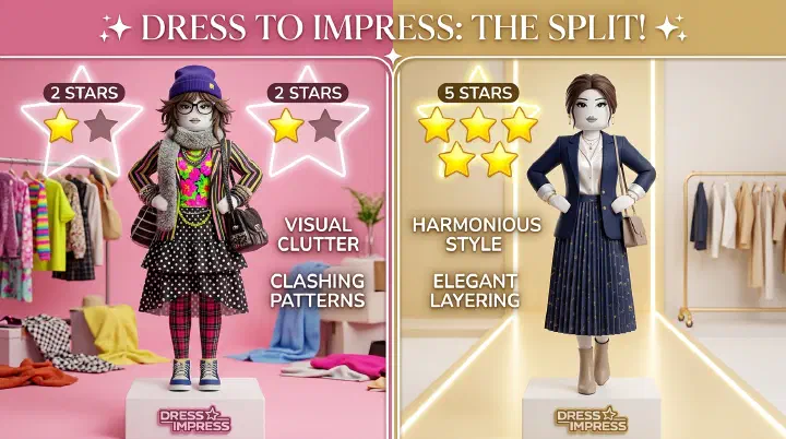
The theme is “Gothic Elegance.” You layer a lace pattern over a velvet texture, add a damask corset, and finish with a spiderweb veil. You think you’ve created art. The voting screen shows: 2 stars. The winner is wearing a single black dress with zero patterns. You check the chat: “too busy,” “looks like a tablecloth,” “my eyes hurt.” You over-layered, and the voting lobby punished you for it.
This scene plays out every single day in Dress to Impress lobbies. Pattern mixing isn’t just a skill, it’s a minefield. One wrong texture combo tanks your score before anyone even reads your outfit’s intent. Most players assume more detail equals more effort equals more stars. The voting booth doesn’t work that way. In DTI, visual clarity wins. Patterns are seasoning, not the main course.
This guide breaks down why pattern layering fails, which textures actually pair well, and the counter-intuitive rules top players use to score 4-5 stars consistently.
Why Your Pattern Layering Keeps Failing
Let’s dissect that Gothic Elegance disaster. Four patterns: lace, velvet, damask, spiderweb. Each one is a visual statement. When you stack four statements on top of each other, the eye doesn’t know where to land. Voters don’t analyze your outfit. They glance at it for 1-2 seconds and form an instant impression. If that impression is chaos, you get chaos stars.
Clashing Scales Kill Readability
The biggest mistake in DTI pattern mixing is ignoring scale. Lace has a tiny, repetitive grid. Damask has large, sweeping motifs. Spiderweb has medium, angular lines. When these three scales share the same outfit, each scale fights for attention. Your brain processes small patterns as texture and large patterns as objects. Stack them wrong and the viewer’s brain short-circuits.
A micro-pattern (like small polka dots) reads as surface detail. A macro-pattern (like large floral) reads as shape. If you put macro-floral tights under a micro-check skirt, the floral competes with the skirt’s silhouette instead of supporting it. The outfit looks “off” even if the colors match perfectly.
Competing Focal Points
Every outfit needs one hero. In DTI, that hero is usually the silhouette, the color story, or a single standout accessory. When you add multiple patterns, each pattern tries to be the hero. Lace demands attention at the neckline. Damask screams at the waist. Spiderweb grabs the face. Voters’ eyes bounce around like a pinball machine and land on nothing. The outfit feels exhausting.
Think of patterns as characters in a story. One protagonist is compelling. Three protagonists is a mess. Your outfit needs supporting actors, not co-leads.
Color Theory Violations
Patterns don’t just bring shapes. They bring multiple colors. A plaid skirt might contain red, black, and cream. A striped top might have navy, white, and gold. Combine them and you’ve suddenly got six or seven colors fighting for space. DTI’s lighting and camera angles already compress color detail. Too many hues turn into mud on the voting screen.
Even monochromatic patterns fail if their tones clash. A warm cream lace against a cool silver stripe creates visual dissonance. The viewer feels something is wrong without knowing why. That feeling translates to a lower vote.
Ignoring Silhouette
Patterns follow the shape they’re applied to. Vertical stripes make legs look longer. Horizontal stripes widen the torso. Small all-over prints flatten curves. Large motifs interrupt the outline. When you cover every surface in pattern, you lose control of your silhouette.
DTI’s runway camera loves clean shapes. A dramatic shoulder, a cinched waist, a flowing train, these read well because they’re readable from distance. Pattern noise obscures shape. If voters can’t see your silhouette in two seconds, they can’t appreciate your styling intent.
The Pattern Pairing Matrix: What Actually Works
Here’s the framework. Not all patterns are enemies. Some are best friends. Others are mortal enemies. This matrix covers the most common DTI textures and how they interact.
| Pattern | Best Pairs With | Never Mix With | Why |
|---|---|---|---|
| Lace | Solid satin, velvet, plain cotton | Another lace, busy brocade, sequins | Lace is delicate; it needs a quiet partner or it turns into visual static |
| Velvet | Solid silk, subtle pinstripe, plain wool | Corduroy, busy floral, glitter | Velvet already catches light; competing textures look cheap |
| Floral (small) | Solid colors, subtle gingham, denim | Another floral, animal print, camo | Small floral reads as texture; pair it with structure, not more noise |
| Floral (large) | Solid blocks only, minimal accessories | Any other pattern, textured fabrics | Large floral IS the outfit; everything else must shut up |
| Stripes | Solids, small dots, one other stripe (same width) | Plaid, chevron, mixed-direction stripes | Stripes create rhythm; break the rhythm and you break the outfit |
| Plaid | Solid knits, denim, plain leather | Another plaid, busy paisley, mixed-scale patterns | Plaid has built-in color complexity; it demands simplicity elsewhere |
| Animal Print | Black solids, neutral tones, leather | Another animal print, neon colors, lace | Leopard/zebra are loud; they need space to breathe |
| Sequins/Glitter | Matte solids only, minimal silhouettes | Any other shiny texture, busy patterns | Glitter is already screaming; don’t add a choir |
| Denim | Plain white, stripes, small floral | Double denim (same wash), camo, busy prints | Denim is casual structure; don’t overcomplicate it |
| Camo | Solid earth tones, black, minimal leather | Another camo, bright colors, delicate lace | Camo is aggressive patterning; it bulldozes everything near it |
Use this matrix before you layer a single texture. If your planned combo hits the “Never Mix With” column, pick one pattern and commit. Your stars will thank you.
The 3-Step Layering Method
This is the workflow top DTI players use to build pattern outfits that score well. It’s not about restriction. It’s about controlled impact.
Step 1: Anchor with a Solid Base
Start naked. Pick your silhouette first. A solid dress. A solid suit. A solid jumpsuit. This is your canvas. It defines the shape voters see from across the lobby. No patterns yet. No textures. Just clean lines and good proportions.
Why solids first? Because you can’t judge a pattern’s impact without a foundation. It’s like putting icing on a cake that doesn’t exist yet. Your base color should be neutral or theme-appropriate. Black, white, navy, cream, or a single bold color that fits the round’s prompt.
Step 2: Add ONE Hero Pattern
Now add pattern to ONE major piece. Not two. Not three. One. This is your visual interest. Options:
- Patterned skirt with solid top
- Patterned jacket with solid dress
- Patterned tights with solid shorts and top
- Patterned scarf or wrap with solid everything else
The hero pattern should relate to your theme. “Spring Picnic” wants florals. “Business Casual” wants subtle pinstripes. “Retro Diner” wants polka dots or gingham. The pattern carries the theme so the silhouette doesn’t have to.
If your hero pattern is large-scale (big floral, bold geometric), keep it to the largest garment piece. If it’s small-scale (tiny dots, micro-check), you can use it on a secondary piece like tights or a belt.
Step 3: Texture, Not Pattern
This is where most players derail. They add a second pattern here. Don’t. Add texture instead.
Texture is surface quality without competing motif. Satin sheen. Wool fuzz. Leather gloss. Chiffon transparency. These add depth and luxury without adding visual noise. A solid velvet blazer over a floral dress. A leather belt on a plaid skirt. A satin ribbon in lace hair. Texture elevates. Pattern distracts.
If you absolutely must add a second pattern, use the matrix. Make it tiny. Make it secondary. A small polka-dot bow on a striped dress. A thin pinstripe sock with a floral skirt. The second pattern should be so small that voters register it as detail, not as a competing element.
Counter-Intuitive Truth: The Best Pattern Combo Is Often Just One Pattern
Here’s the advice that separates 4-star players from 2-star players. You don’t need to layer patterns to look advanced. You need to layer textures around a single pattern.
Look at the DTI runway winners. The outfits that get 5 stars and “OMG HOW” in chat. Most of them use one pattern, max. The rest is solid color + texture play. A red floral dress with a black velvet choker and satin pumps. That’s it. One pattern. Three textures. Clean silhouette. Perfect score.
The human eye craves simplicity with subtle complexity. One pattern gives the brain something to notice. Solids and textures give the brain space to rest. That rhythm, notice, rest, notice, rest, is what makes an outfit feel expensive and intentional.
Ten patterns feels like you tried too hard. One pattern feels like you know exactly what you’re doing.
Advanced Layering: When More Patterns Actually Work
Okay, there are exceptions. Some themes and some high-skill builds can handle 2-3 patterns. But they follow strict rules.
The Monochrome Multi-Pattern
Use three patterns in the exact same color family. A black lace top, a black pinstripe skirt, and a black polka-dot scarf. The patterns don’t clash because the color unifies them. The eye reads texture variation, not pattern chaos.
This works best with neutrals. Black, white, navy, beige. Colorful monochrome multi-pattern (red floral + red stripes + red dots) can work but it’s harder to pull off in DTI’s lighting. Stick to dark or light neutrals for safety.
The Pattern Family Rule
Some patterns are cousins. They share visual DNA. Stripes and pinstripes. Gingham and plaid (different scales). Small floral and botanical print. These can layer if you separate them with solid space.
Example: gingham skirt, solid white blouse, plaid jacket in matching tones. The skirt and jacket patterns echo each other without competing because the solid blouse creates a buffer zone. Without that buffer, they’re just two conflicting grids.
The Statement Accent
Use a wild pattern on a tiny surface area. A leopard print clutch. A snakeskin shoe. A cosmic-patterned hair bow. The pattern is so small in visual weight that it reads as an accessory, not a layer. This adds personality without breaking the outfit’s coherence.
The key is limiting the wild pattern to less than 10% of the total visible outfit. Any more and it becomes a second hero. Any less and voters miss it entirely.
Background Color Matters More Than the Pattern Itself
This is the secret most DTI players never learn. The background color of your pattern, the negative space between the motifs, determines how the pattern reads in the lobby.
A floral dress with a white background reads light, airy, and casual. The same floral on a black background reads moody, formal, and dramatic. The pattern hasn’t changed. The vibe completely has.
In DTI’s fast-voting environment, background color sets the first impression before anyone processes the actual motif. Dark backgrounds read as sophisticated. Light backgrounds read as playful. Mid-tone backgrounds read as safe and sometimes boring.
When choosing patterns, ignore the motif for a second. Look at the background color. Does it match your intended silhouette and theme? A “Vampire Queen” in light-pink-background floral is fighting herself. A “Spring Fairy” in black-background damask is sending mixed signals.
Match background color to mood first. Then worry about whether polka dots or stripes serve the outfit better.
Pattern Placement for DTI’s Camera
DTI’s runway camera isn’t kind. It flattens depth, compresses detail, and loves contrast. Patterns that look amazing in the dressing room can turn to mush on the runway.
Upper body patterns read better. The camera spends more time at chest and face level. A patterned top or jacket gets seen. Patterned shoes often disappear into the floor plane.
Horizontal patterns widen on camera. A horizontal-striped skirt looks broader in the voting screenshot than it does in the mirror. Vertical patterns elongate. Use this to your advantage.
Tiny patterns blur together. Micro-checks and tiny florals can turn into solid-colored mush at distance. If you’re using a small pattern, make sure it has strong contrast so it still reads as pattern.
Large patterns get cropped awkwardly. A huge floral on a skirt might have its center cut off by the hemline, leaving weird half-flowers. Preview your outfit from the runway camera angle, not just the front mirror.
The “Busy Test”: 3-Second Rule
Before you lock in your outfit, do this. Look away from your screen for ten seconds. Look back. You have three seconds to answer: what’s the first thing I notice?
If the answer is “pattern explosion,” strip one pattern. If the answer is “I can’t tell what the theme is,” add a thematic solid anchor. If the answer is “that silhouette is clean,” you’re probably ready.
Voters spend less time on your outfit than you just spent on that test. Design for the glance, not the inspection.
Putting It All Together: Two Real Examples
Example 1: “Garden Tea Party” (Safe 4-Star Build)
- Solid pastel yellow sundress (base silhouette)
- Small white floral print on the skirt only (hero pattern, lower body)
- White lace gloves (texture, not competing pattern)
- Straw hat with solid ribbon (texture + solid accent)
- White Mary Jane shoes (solid grounding)
One pattern. Three textures (lace, straw, satin ribbon). Clean pastel story. Voters read “spring” instantly. The floral placement on the skirt follows camera logic. The solid top half keeps the silhouette visible. This build wins consistently because it communicates the theme in one glance without visual fatigue.
Example 2: “Punk Rocker” (Risky 5-Star Build)
- Black ripped fishnet tights (texture/pattern hybrid)
- Solid black leather mini skirt (silhouette anchor)
- Plaid flannel shirt, worn open over solid black tank (one hero pattern, upper body)
- Studded belt and choker (texture, metallic)
- Combat boots (solid, grounding)
Two patterns if you’re counting fishnet, but fishnet at leg scale reads as texture in DTI’s camera. The plaid is the clear hero. The black base unifies everything. The studs add edge without adding motif. This works because the pattern is thematic, the base is solid, and the textures agree on “tough.”
Try to add a leopard print scarf and a striped arm warmer to this build. It collapses. Three patterns plus two textures plus rips plus studs equals visual shouting. Punk doesn’t mean chaotic. Punk means controlled rebellion.
Final Thoughts
Pattern layering in Dress to Impress isn’t about showing off every texture you own. It’s about choosing what to say and silencing everything else. The best outfits whisper one clear idea. They don’t scream ten half-baked ones.
Use the matrix. Start with solids. Add one hero pattern. Support with texture, not more noise. Check your background colors. Test against the runway camera. And remember, the voting lobby rewards clarity, not complexity.
Next time the theme is “Gothic Elegance,” skip the lace-velvet-damask-spiderweb stack. Try a solid black velvet gown, one lace choker, and a single damask clutch. Same theme. Same pieces, basically. Completely different score. That’s the power of knowing when to stop.
Related Guides